MSU Federal Credit Union

A brand prompting scalability, innovation, and audience trust for a community-centric financial institution with a longstanding reputation.


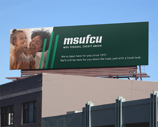
After 40 years as a trusted community financial institution, Michigan State University Federal Credit Union (MSUFCU) sought a new brand that would prioritize accessibility, scalability, and modernism. We built a visual brand that balanced its energetic personality with its dependable corporate responsibilities.
The new logo featured three lines subtly forming an "M," symbolizing MSUFCU’s commitment to members, employees, and the community. Hand-rendered, lowercase typography enhanced accessibility and conveyed a welcoming yet professional tone. With a membership spanning teens to centenarians, we crafted a thoughtful launch strategy using messaging such as "Same dreams, new look" to reassure and engage audiences.

brand applications as part of a comprehensive visual brand system.
sub-brands created for MSUFCU, including the Desk Drawer Foundation and Reseda Group.